Elon Tile & Stone

THE NATURAL CHOICE
For more than half a century, Elon Tile & Stone has been a leading name in the tile and stone industry, recognized for its commitment to quality, innovation, and exceptional service. Founded in 1966, the company sources premium materials from top quarries around the world and upholds rigorous quality-control standards to ensure consistency, beauty, and durability across every product line. Through its exclusive dealer and trade-focused distribution model, Elon supports designers, architects, and retailers with a carefully curated selection of natural stone, porcelain, ceramic, mosaics, and specialty waterjet pieces. With a legacy built on integrity, craftsmanship, and long-term relationships, Elon Tile & Stone continues to be a trusted resource for high-end surfaces that elevate residential and commercial environments alike.


JUMP TO A SECTION:
→ BRAND & LOGO REFRESH
→ BRAND GUIDELINES
→ WEBSITE IMPROVEMENTS
→ EMAIL MARKETING
→ SOCIAL MEDIA
→ PRINT COLLATERAL
—
ELON TILE & STONE
BRAND & LOGO
REFRESH
→ ABOUT THIS PROJECT
PROBLEM
Over its long-standing 59-year history, Elon Tile & Stone had maintained only two logos, resulting in brand inconsistencies and limited visual flexibility across modern digital and print platforms. The existing logo, while iconic, lacked adaptability for varying applications, and the color palette and design elements were outdated, which made it challenging to present a cohesive and contemporary brand identity. This limited the brand’s ability to stand out in competitive markets and connect effectively with newer audiences.
SOLUTION
To address these challenges, I led a strategic logo refresh that honored the brand’s heritage while modernizing its visual identity. I introduced a refined color palette of natural brown and muted earthy green to create a timeless and versatile look, integrated the original “E” emblem into the primary logotype for continuity, and reintroduced the bold “E” mark for high-visibility applications such as social media. Additionally, I designed three distinct logo variations to ensure flexibility across digital and print materials, enabling consistent and impactful brand presentation across all touchpoints.
TARGET AUDIENCE
The refreshed Elon Tile & Stone brand is designed to appeal to a discerning audience seeking affordable luxury—clients who value high-quality, timeless design without compromising on style or accessibility. By introducing a subtle gold accent into the brand’s color palette, we elevate the visual identity to convey sophistication and premium craftsmanship, while maintaining the approachable and natural tones of brown and muted green. This strategic combination positions the brand to resonate with homeowners, designers, and industry professionals who appreciate elegance, quality, and versatility in both residential and commercial spaces.
DELIVERABLES
Primary logo redesign
Bold “E” emblem for social media and high-visibility use
Three logo variations for digital and print applications
Refined color palette: natural brown, muted earthy green, and gold accent
Integration of original “E” emblem into logotype
Brand guidelines for consistent application across platforms
Digital and print-ready files for all logo variations
MY ROLE
Led the brand refresh and logo evolution for Elon Tile & Stone, including strategic direction, design development, and implementation. Responsibilities included color palette selection, integration of the original “E” emblem into the logotype, creation of multiple logo variations for digital and print, and ensuring cohesive application across all brand touchpoints, including social media, marketing materials, and product placements.
PROJECT TYPE
Brand Identity Refresh and Logo Redesign
BEFORE LOGO REFRESH

AFTER LOGO REFRESH

—
ELON TILE & STONE
BRAND GUIDELINES
→ ABOUT THIS PROJECT
PROBLEM
Elon Tile & Stone faced a significant "brand fragmentation" issue. Across their various B2B channels—digital, print, email, social media, and showroom board labels—the visual identity was inconsistent. Disjointed logos, mismatched typography, and an undefined color palette weakened brand recognition among dealers and distributors. This lack of a unified system made it difficult for internal teams to produce cohesive marketing materials quickly and professionally.
SOLUTION
I developed a comprehensive Brand Identity System and Guidelines to serve as the definitive blueprint for the Elon Tile & Stone brand. By codifying the logo usage, typography, and professional color theory, I provided the framework for an 80% increase in brand engagement. This growth was driven by a newfound visual authority; when the brand looked more "premium" and consistent, dealers perceived the products as higher value, leading to increased trust and interaction across all touchpoints.
TARGET AUDIENCE
The primary audience for these guidelines includes in-house marketing/creative teams, internal sales teams, and B2B partners. By providing clear "rules of the road," we ensured that anyone representing Elon Tile & Stone—from a local showroom printer to a national distributor—delivered a high-end, unified experience that resonates with sophisticated interior designers and customers.
DELIVERABLES
Core Identity Assets: Refined logo suite (primary, secondary, and submarks).
Typography System: Primary and secondary font pairings for digital and print.
Color Architecture: Defined HEX, RGB, and CMYK palettes for brand consistency.
Iconography & UI Elements: Custom-designed icons for product categories and materials.
Imagery Style Guide: Standards for lifestyle photography vs. product-only shots.
Brand Voice & Tone: Guidelines for B2B communication and professional messaging.
Comprehensive Brand Book: A digital manual for corporate communications and beyond.
MY ROLE
I served as the Creative Director and Brand Strategist. I audited the existing brand chaos and distilled it into a streamlined, modern visual system. My responsibilities included the design of all core assets, the technical writing of the usage rules, and the creation of the final Brand Book. I also led the internal rollout, ensuring that the new standards were applied to the social and email campaigns that eventually saw the 80% engagement spike.
PROJECT TYPE
Brand Identity Design & Corporate Standards
—
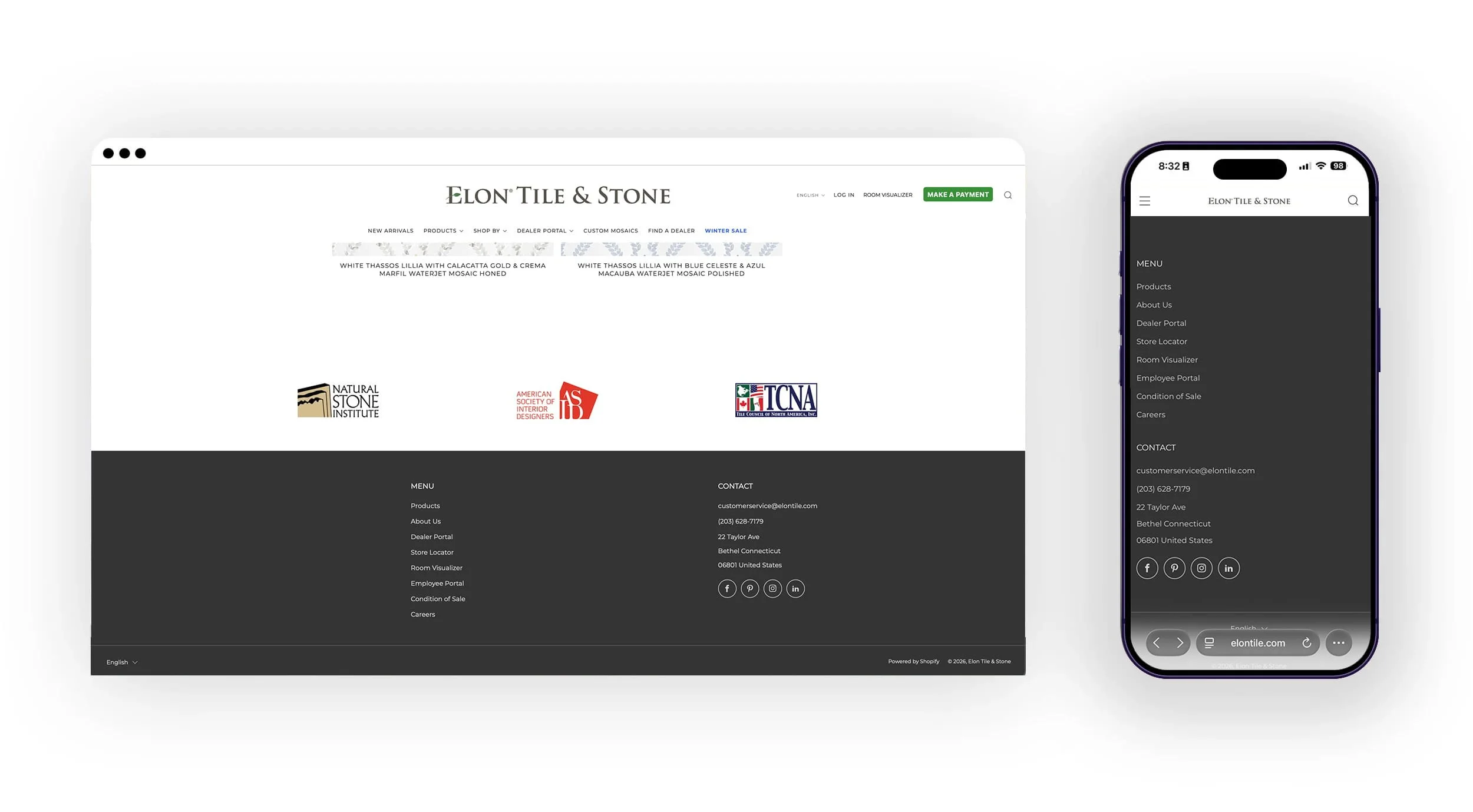
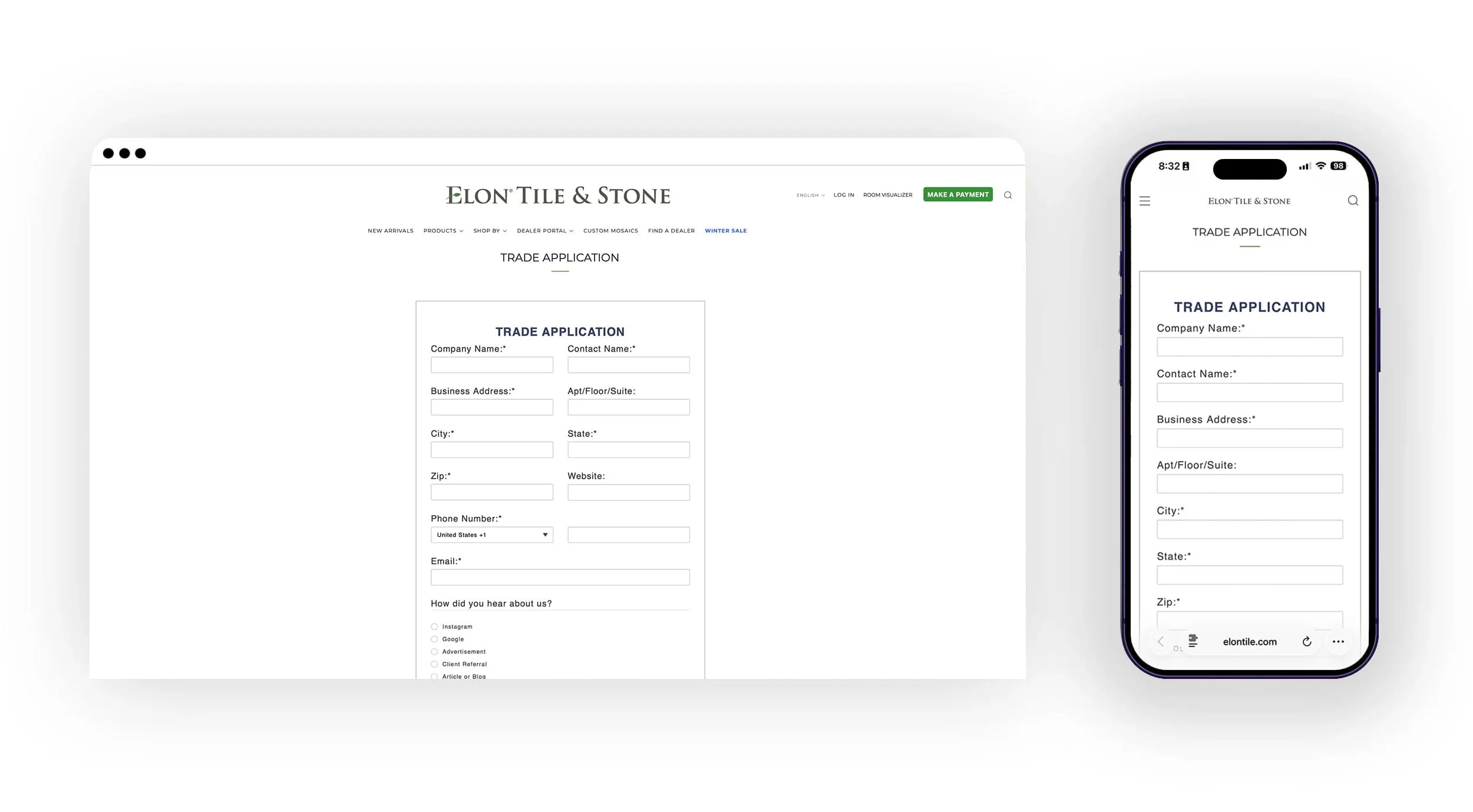
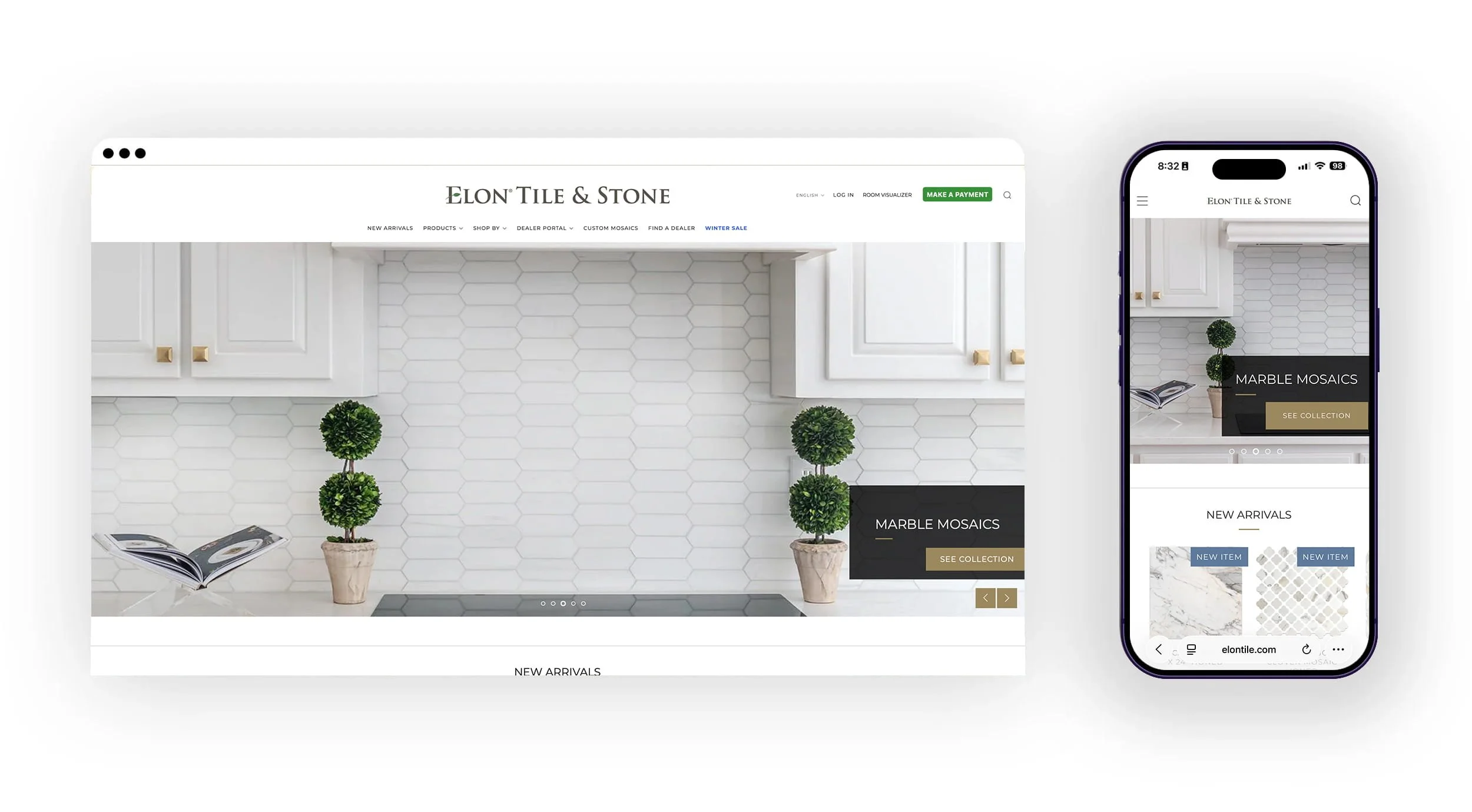
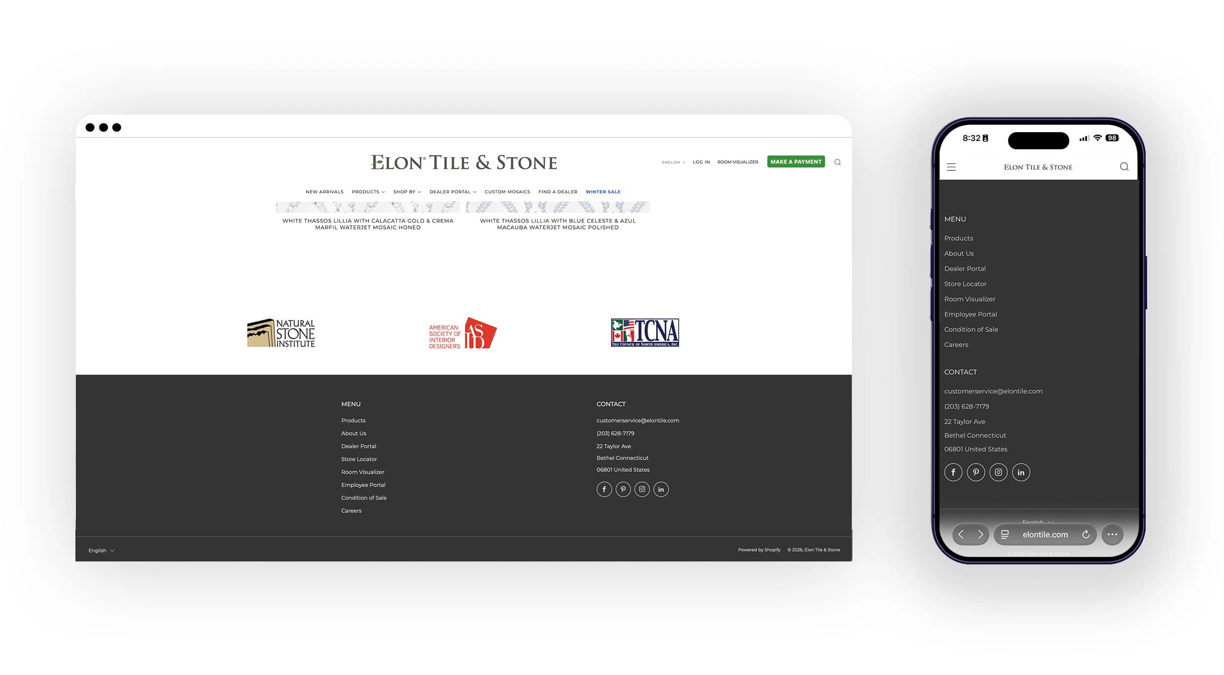
ELON TILE & STONE
WEBSITE IMPROVEMENTS
→ ABOUT THIS PROJECT
PROBLEM
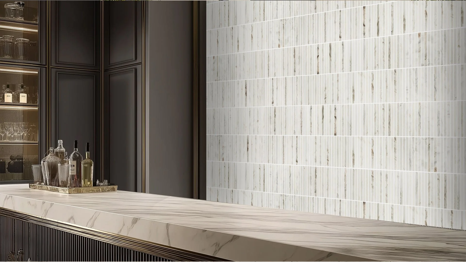
The existing website felt dated and lacked the high-end "editorial" feel expected by architects and interior designers. Key issues included cluttered navigation, low-resolution imagery that failed to showcase material textures, and a friction-heavy sample ordering process that discouraged conversions.
SOLUTION
test
TARGET AUDIENCE
Interior Designers & Architects: Looking for technical specs and high-quality visuals for mood boards.
Luxury Homeowners: Seeking inspiration and looking to locate the nearest authorized dealer.
Showroom Partners: Who need a reliable digital resource to show clients during consultations.
DELIVERABLES
Responsive Web Design: A mobile-optimized experience for on-site consultations.
Interactive Product Catalog: Filterable by material, color, and application.
Brand Style Guide: Updated digital color palette and typography.
High-Fidelity Prototypes: Interactive walkthroughs for the new checkout and search flows.
MY ROLE
Lead UX/UI Designer. I was responsible for the end-to-end process, including wireframing, page re-vamps, visual design, testing new features, and overseeing the hand-off to the development team.
PROJECT TYPE
E-commerce Redesign & Brand Refresh.
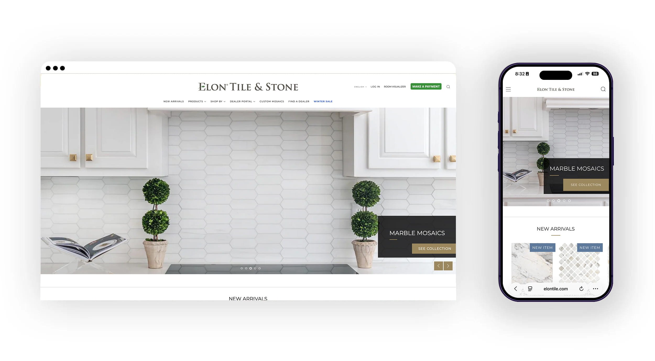
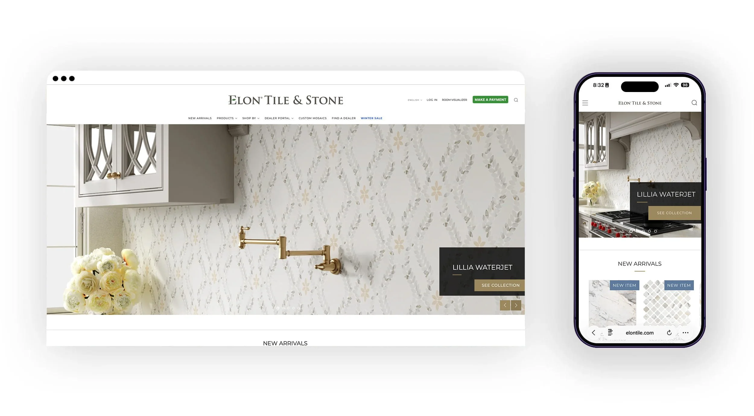
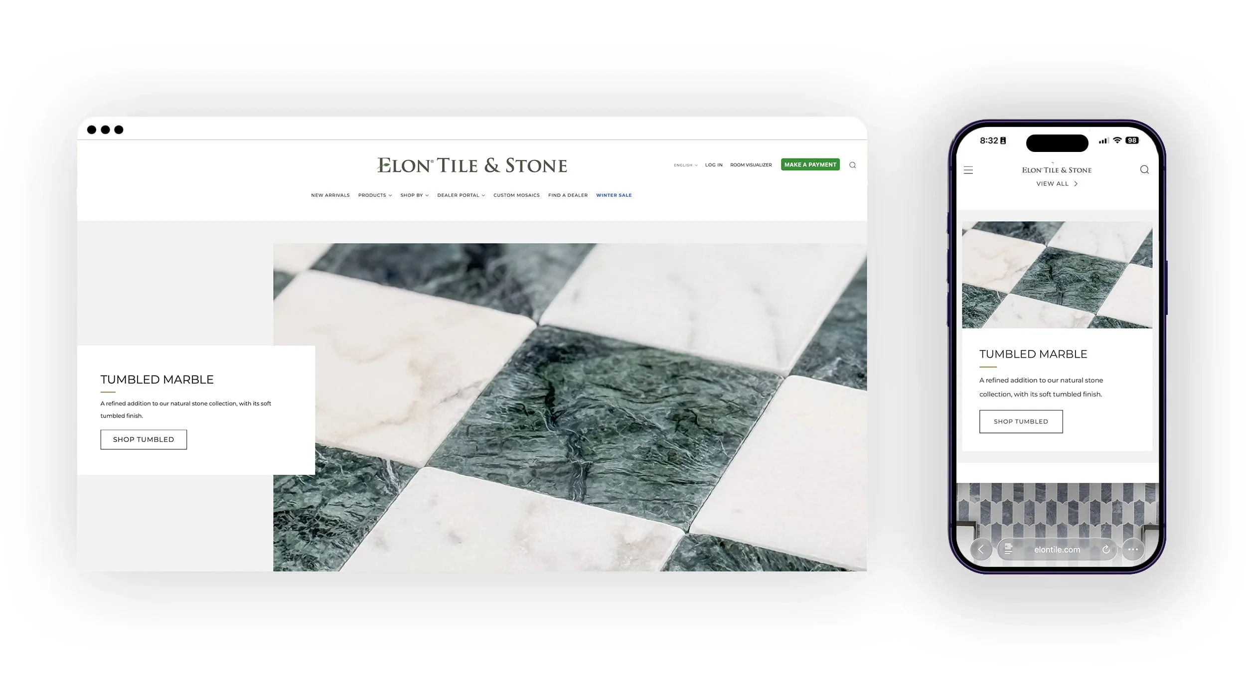
BEFORE REFRESH


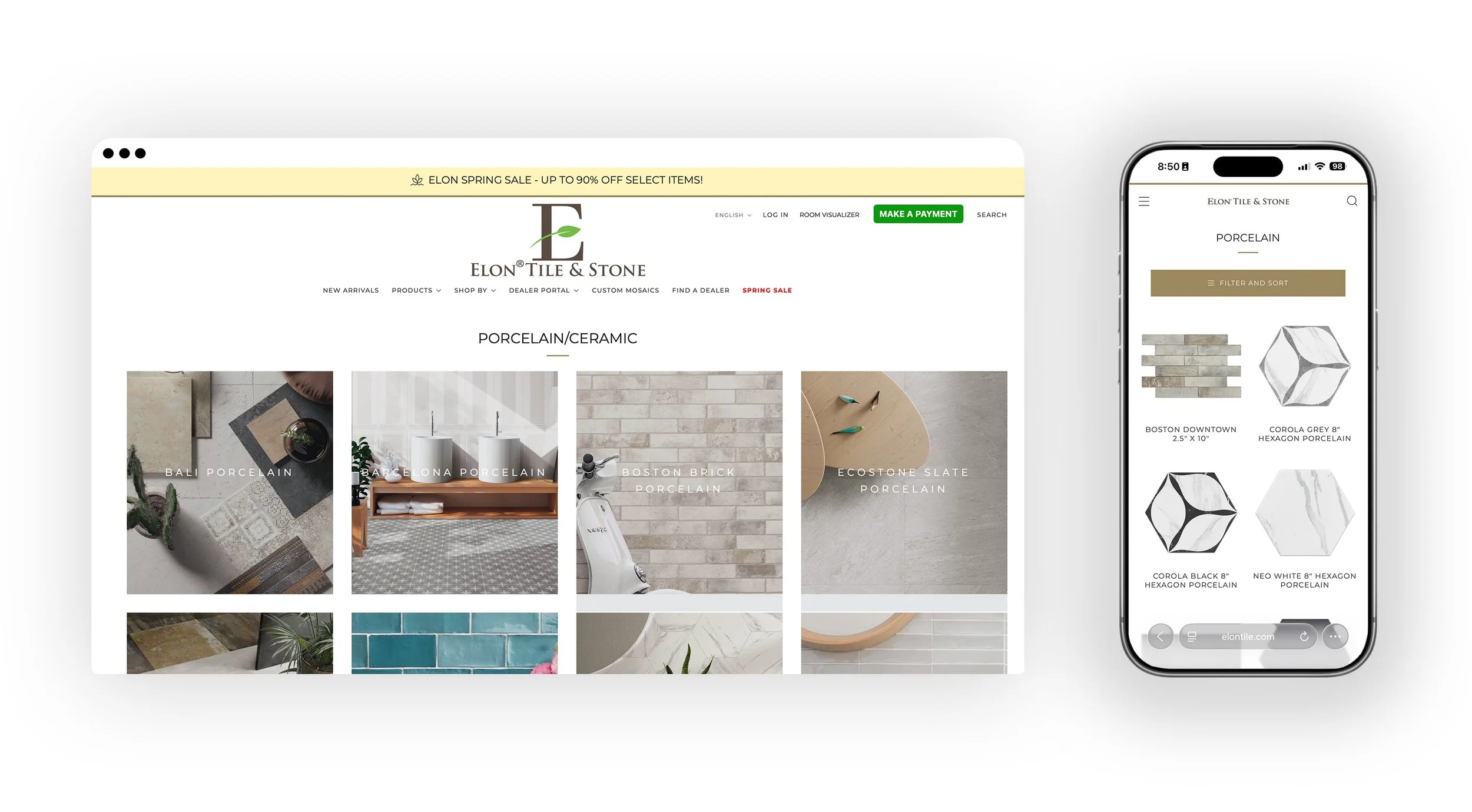
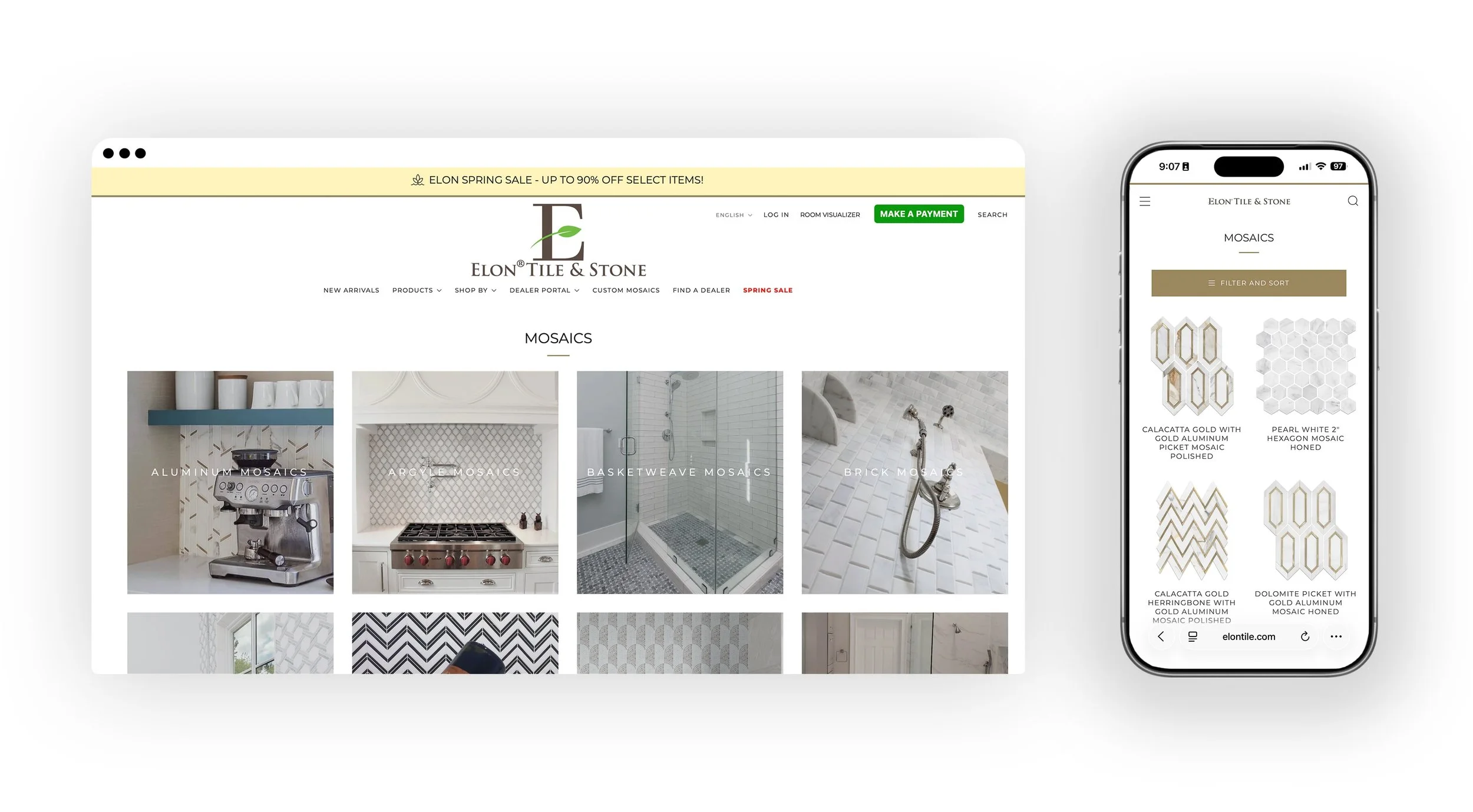

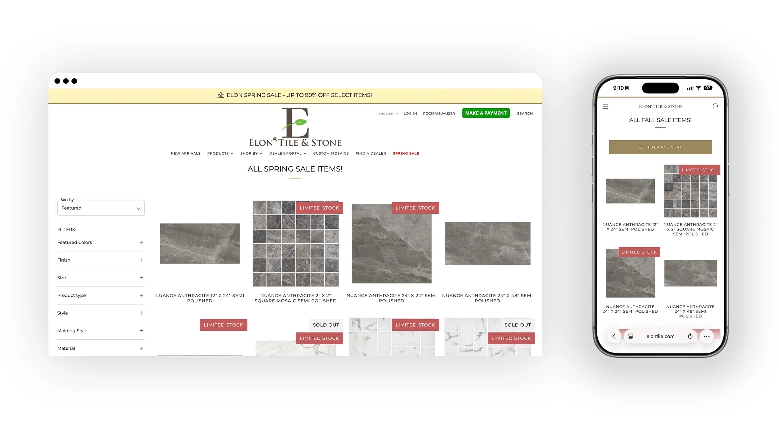


TO VIEW LARGER:
desktop: click thumbnails below to enlarge and navigate with: < >
mobile: tap thumbnails below to enlarge and navigate with swiping


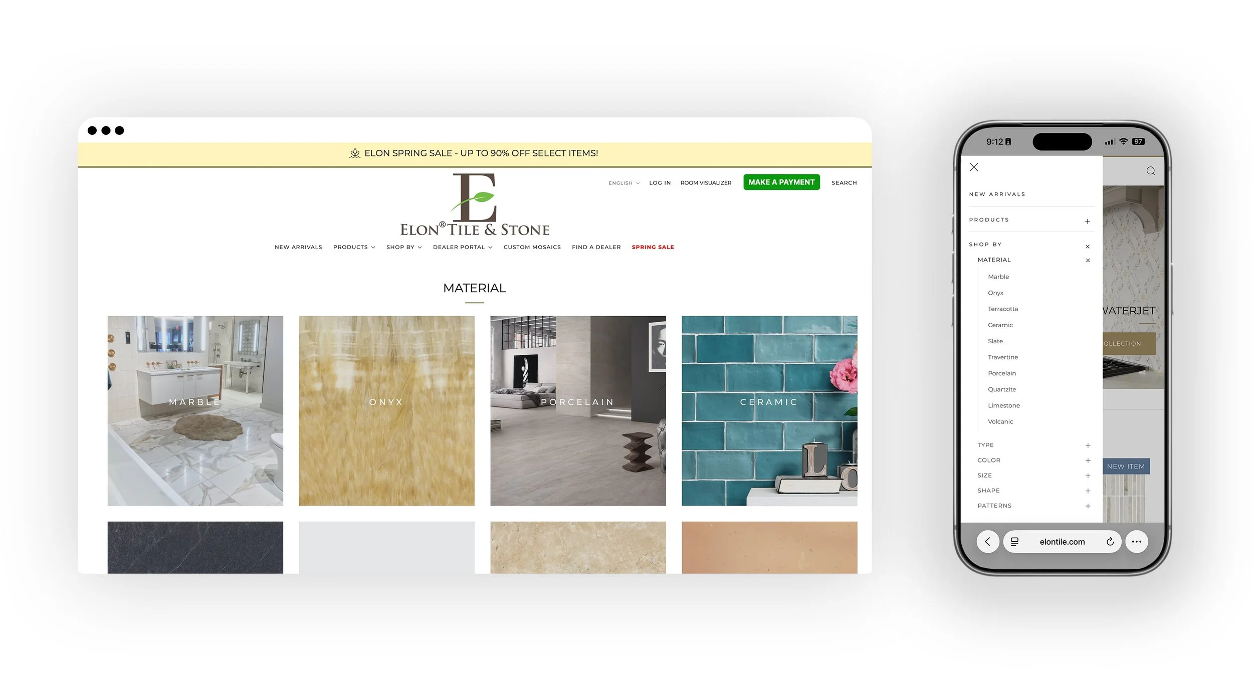
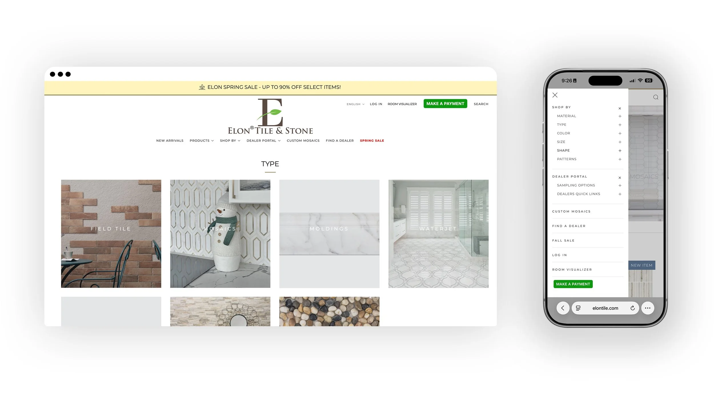
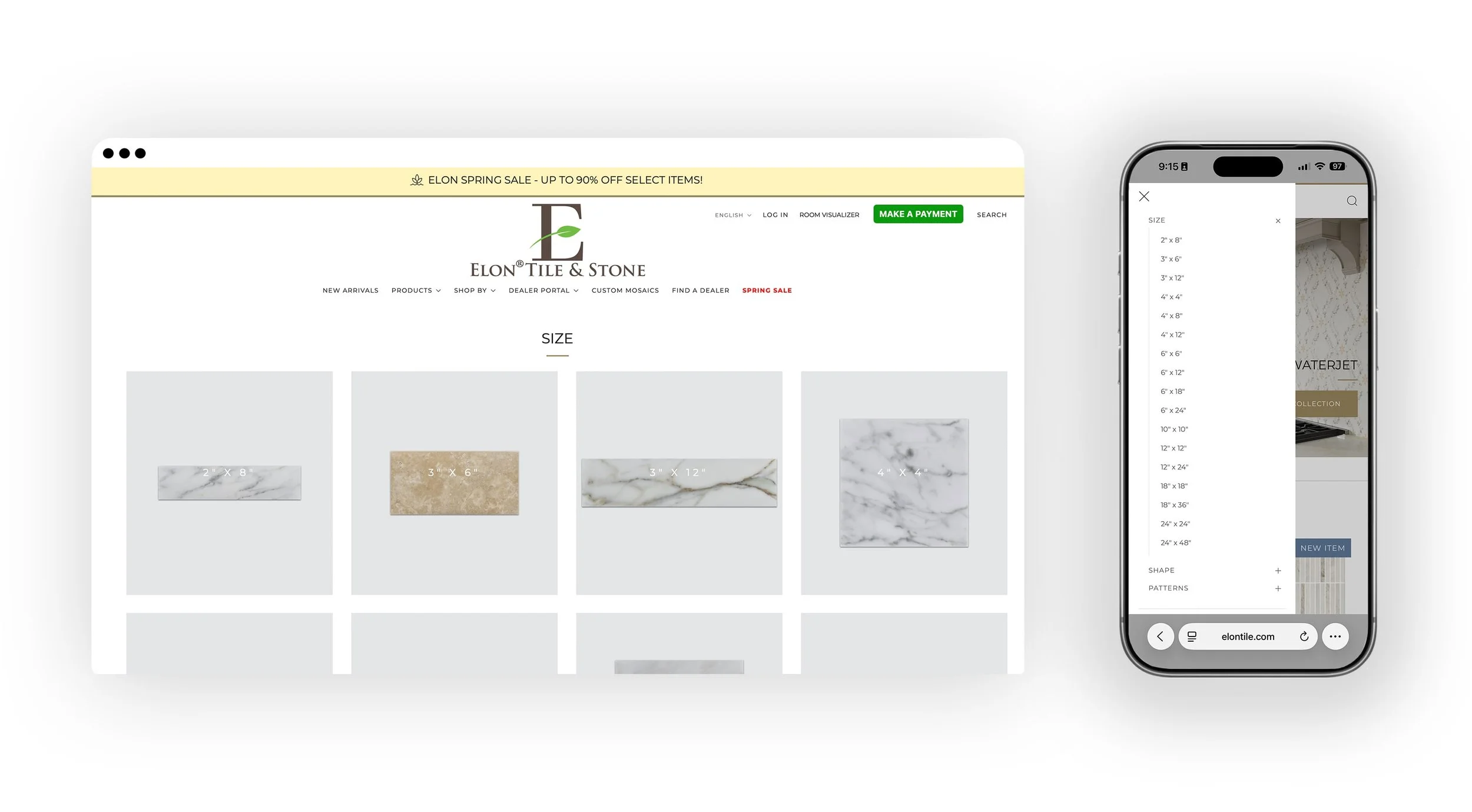

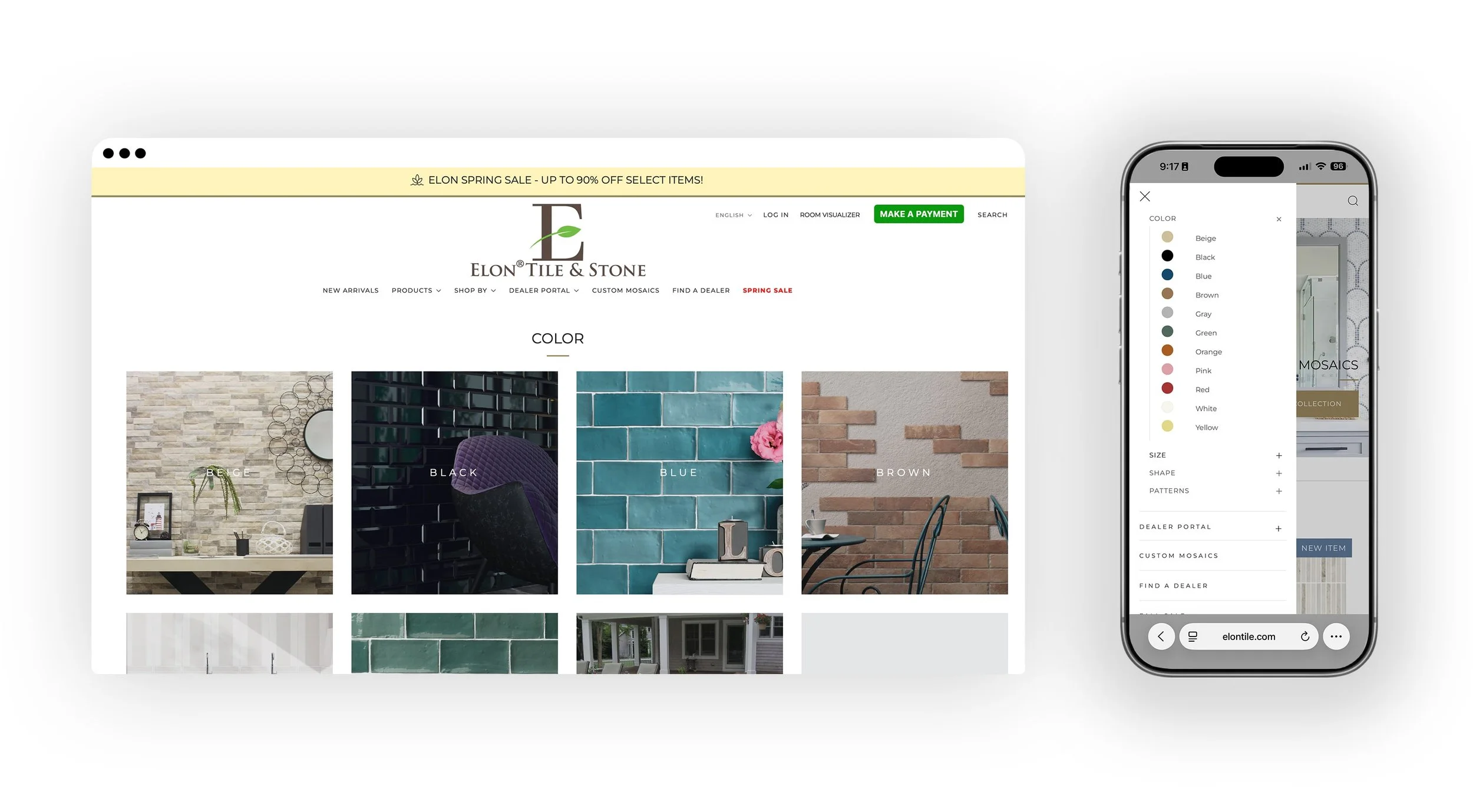
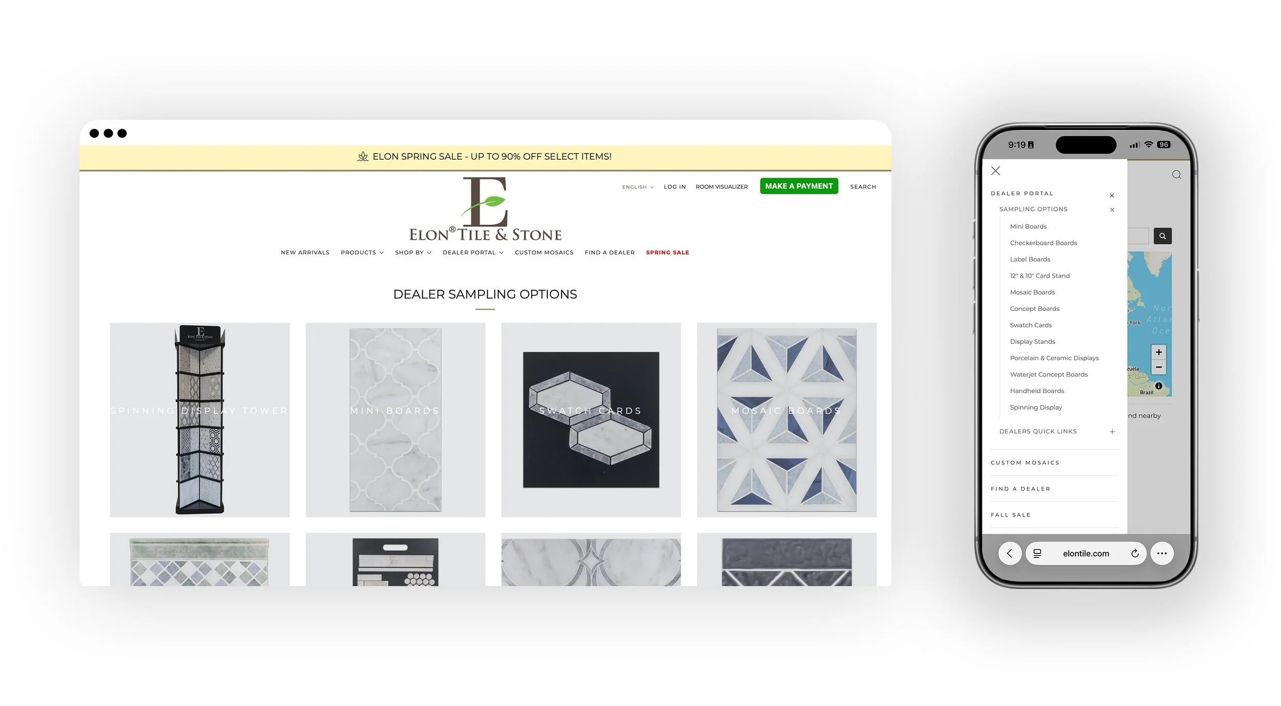
AFTER REFRESH


—
ELON TILE & STONE
EMAIL MARKETING
→ ABOUT THIS PROJECT
PROBLEM
Elon Tile & Stone’s B2B email marketing to dealers had consistently low open and click-through rates, limiting engagement with new product launches, sales promotions, price updates, and current product offerings. The emails lacked a cohesive visual identity and compelling design elements, which reduced their effectiveness in capturing attention and driving action among industry professionals.
SOLUTION
As part of the brand refresh, the email marketing templates were redesigned to reflect the updated visual identity, incorporating the refined color palette, typography, and logo elements. The refreshed design created a more visually engaging and professional presentation, resulting in improved open and click-through rates. The modernized templates provided consistency across campaigns, strengthened brand recognition, and enhanced communication with dealers about product updates and promotions.
TARGET AUDIENCE
The target audience for Elon Tile & Stone’s email marketing consists of tile and stone dealers, distributors, and industry professionals who rely on timely updates for product launches, pricing changes, and current offerings. These recipients value clear, concise, and visually engaging communications that help them make informed purchasing and inventory decisions. By delivering content that aligns with their professional needs and preferences, the emails aim to strengthen dealer relationships, drive engagement, and support business growth.
DELIVERABLES
Redesigned email templates reflecting the refreshed brand identity
Consistent color palette, typography, and logo integration in emails
Template variations for product launches, sales, pricing updates, and general offerings
Mobile-optimized and responsive email designs
Standardized layouts for text, images, and calls-to-action
Guidelines for maintaining brand consistency across all B2B email campaigns
Analytics tracking setup to monitor open rates, click-through rates, and engagement
MY ROLE
Led the redesign and implementation of Elon Tile & Stone’s B2B email marketing program. Responsibilities included creating visually engaging templates aligned with the refreshed brand identity, developing layouts for product launches, sales, and updates, ensuring mobile responsiveness, and optimizing for improved open and click-through rates. Additionally, I established guidelines for consistent brand application across all email campaigns and monitored analytics to measure performance and inform future strategy.
PROJECT TYPE
B2B Email Marketing Design and Strategy


1st Email (Click Here for Full Zoom) | 2nd Email (Click Here for Full Zoom) | 3rd Email (Click Here for Full Zoom) | 4th Email (Click Here for Full Zoom) | 5th Email (Click Here for Full Zoom) | 6th Email (Click Here for Full Zoom) | 7th Email (Click Here for Full Zoom)
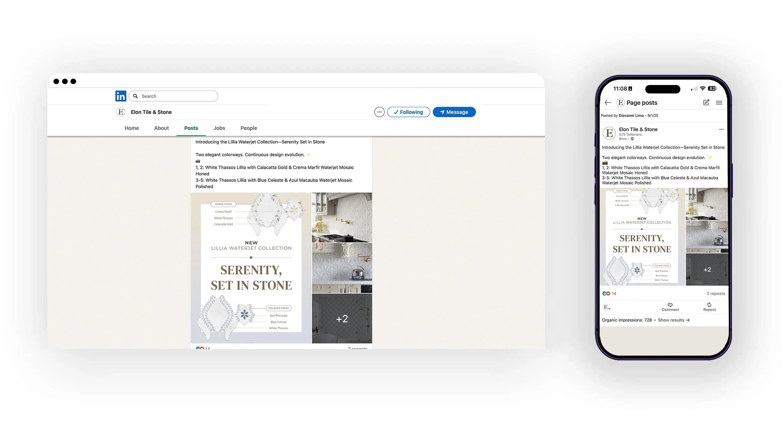
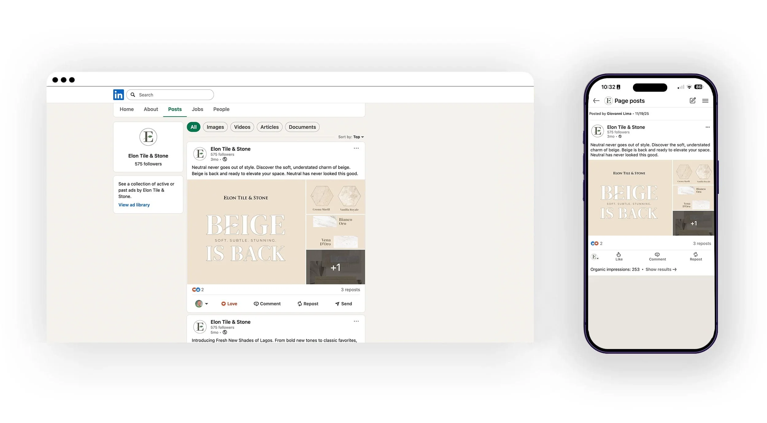
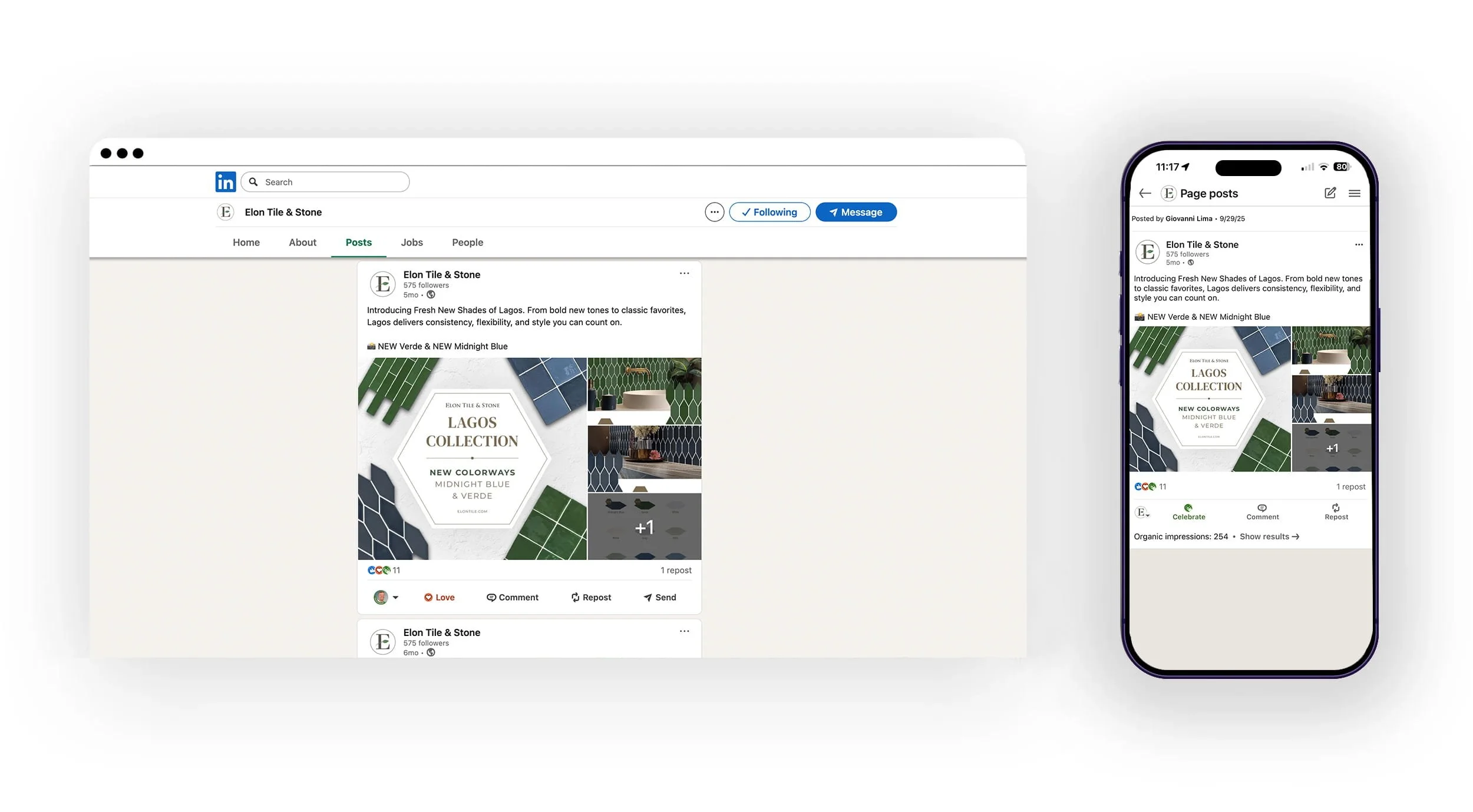
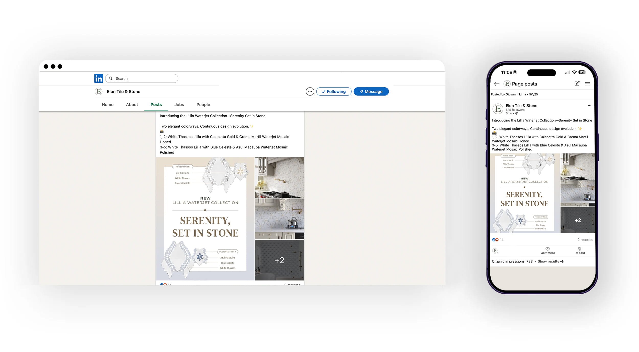
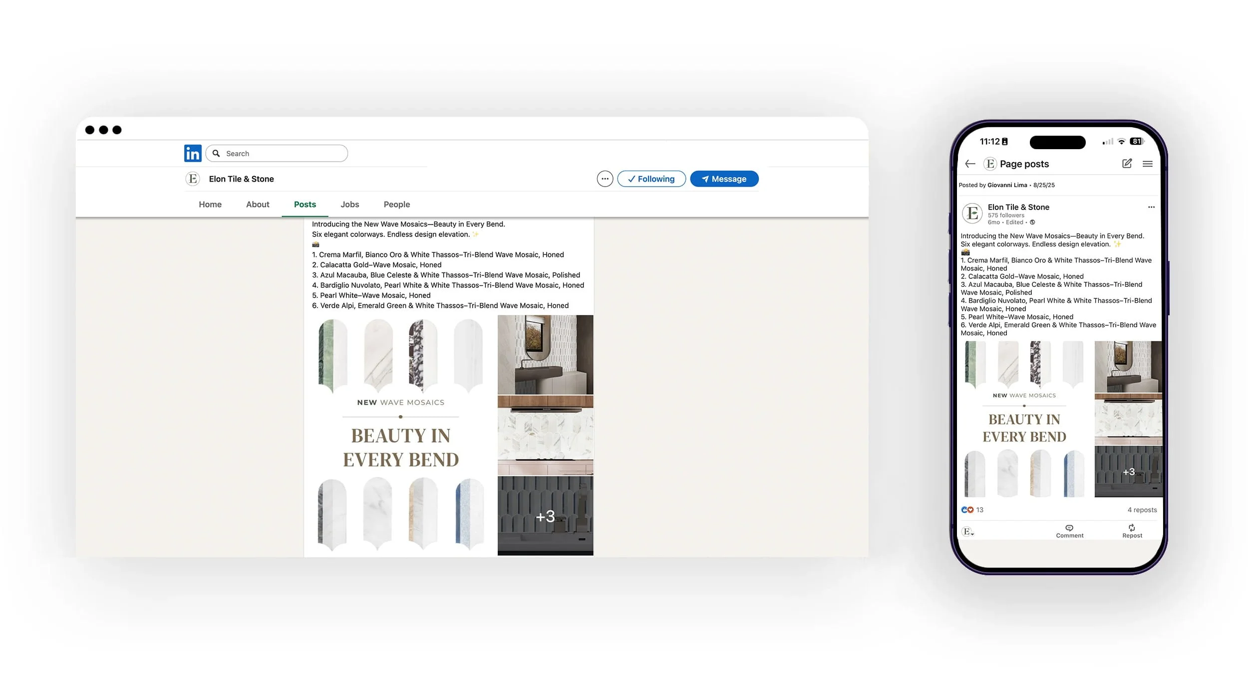
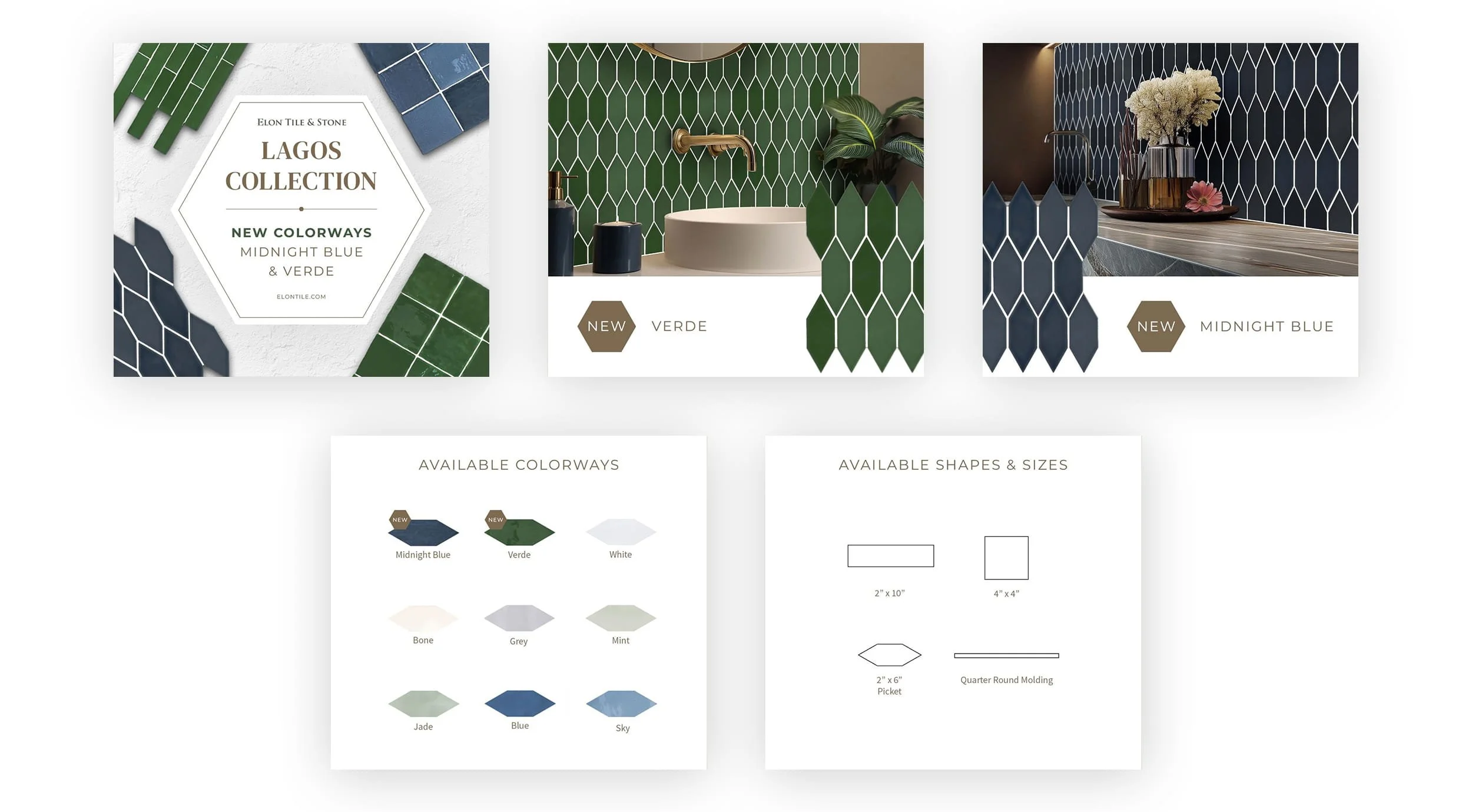
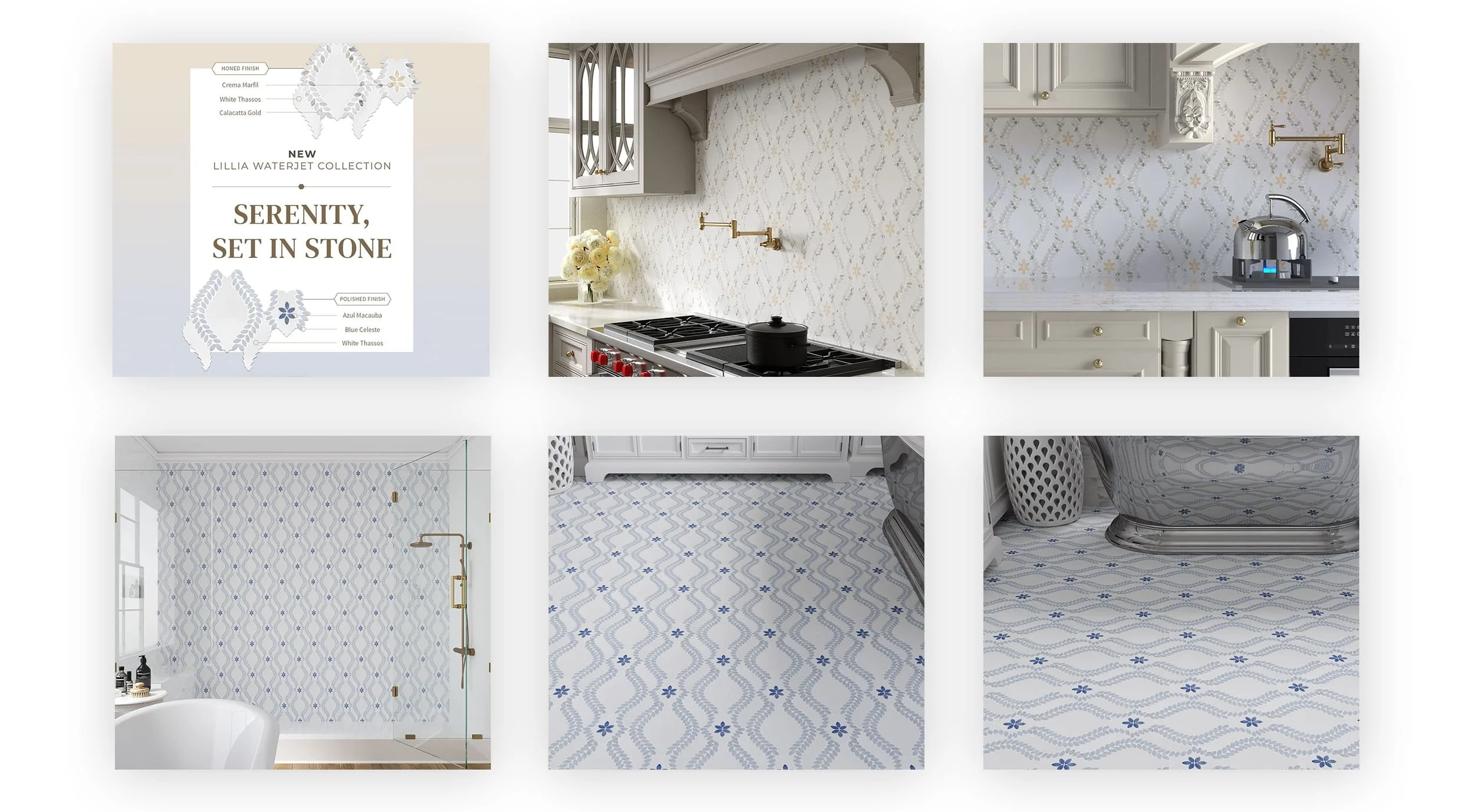
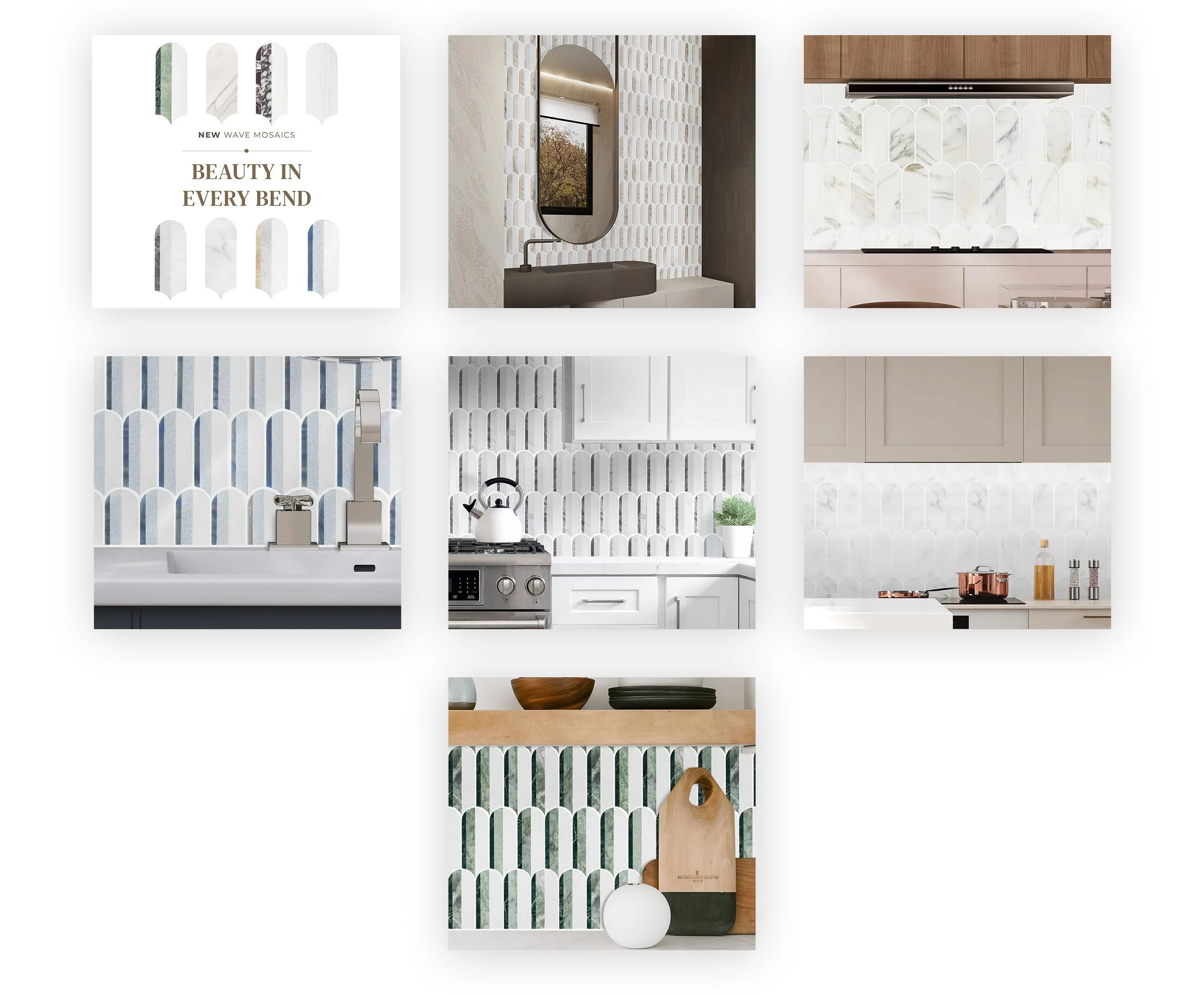
ELON TILE & STONE
SOCIAL MEDIA
→ ABOUT THIS PROJECT
PROBLEM
Elon Tile & Stone’s social media presence was underperforming, with stagnant follower growth and minimal interaction from their B2B dealer network. The content lacked a cohesive aesthetic and failed to showcase the premium nature of the products. Without a clear visual strategy, posts were easily overlooked in crowded professional feeds, missing critical opportunities to showcase new collections and industry updates.
SOLUTION
I transformed Elon Tile & Stone’s social channels into a high-impact visual gallery by applying the brand’s refreshed identity. By prioritizing high-resolution lifestyle imagery, streamlined typography, and a consistent color story, we turned the feed into an indispensable resource for dealers. The strategy shifted from "announcing" to "inspiring," resulting in an 80% increase in total engagement and a significantly stronger digital footprint for the brand.
TARGET AUDIENCE
The strategy targeted new customers looking for inspiration, interior designers and decorators. These targeted audience use’s social media for visual discovery and trend-watching. They require content that is not only informative regarding stock and trends but also "shareable"—providing them with aesthetic inspiration they can pass along to their own clients and designers.
DELIVERABLES
Social Media Brand Kit: Custom templates for Instagram, Facebook and, LinkedIn.
Curated Content Pillars: Defined categories for product spotlights, behind-the-scenes, and dealer features: New Arrivals, Home Installs, Marble Mondays, and Feature Fridays.
Motion Graphics & Reels: Dynamic video templates for new product reveals and deeper product information.
Engagement Strategy: A structured plan for community interaction and hashtag optimization.
Brand Style Guide: Specific rules for photography filters, font overlays, and grid layouts with some posts being more “playful” and “off brand” to attract new customers with a fun approach.
Performance Dashboard: Monthly analytics tracking focusing on shares, saves, and comments.
MY ROLE
I served as the Social Media Strategist and Lead Designer. I was responsible for translating the refreshed brand identity into a digital-first format. This included designing all post templates, directing the visual curation of the grid, and implementing a data-driven posting schedule. I specifically focused on "stopping the scroll" through elevated design, which directly led to the 80% surge in audience engagement.
PROJECT TYPE
B2B / B2C Social Media Strategy & Visual Content Design
INSTAGRAM & FACEBOOK

REELS & STORY POSTS


—
ELON TILE & STONE
PRINT COLLATERAL
→ ABOUT THIS PROJECT
This project involved a comprehensive redesign of the product packaging and labeling system for Elon Tile & Stone. The goal was to elevate the physical brand presence to match the premium quality of their artisanal stone and ceramic collections, ensuring a cohesive look from the showroom floor to the job site.
PROBLEM
The existing labels were utilitarian but lacked brand personality and clear information hierarchy. They failed to differentiate between various stone grades and collections, leading to visual clutter and a "generic" feel that didn't resonate with high-end interior designers or luxury homeowners.
SOLUTION
I developed a refined, minimalist visual system that uses a structured grid and premium typography to communicate essential product data (sku, finish, origin) at a glance. By introducing a muted, sophisticated color palette and high-quality tactile elements, the new labels now serve as a silent ambassador for the brand’s craftsmanship.
TARGET AUDIENCE
Interior Designers & Architects: Who require quick access to technical specs and a clean aesthetic for mood boards.
Showroom Sales Representatives: Who need easily identifiable packaging for inventory management.
Luxury Homeowners: Who value a premium "unboxing" or installation experience.
DELIVERABLES
Product Identification Labels (Multi-size)
Sample Swatch Tags
Branded Shipping Crates & Outer Cartons
Technical Specification Inserts
Care & Maintenance Guidebooks
MY ROLE
Lead Art Director. I was responsible for the visual strategy, layout design, typography selection, and coordinating with the print production team to select durable, moisture-resistant materials suitable for stone storage environments.
PROJECT TYPE
Brand Identity Extension & Print Production
SAMPLE BOARD LABELS

AFTER
BEFORE